
Case Study: Creating Brand Imagery Without a Traditional Shoot
Most of the small brands I work with come to me in exactly the same position, they have perfectly good white background product photos that do the practical job of showing what they sell, but absolutely nothing that explains who they are as a brand or why someone should choose them over anyone else.
This particular project was no different.
The client was a small lifestyle brand selling home fragrance products, mainly candles and diffusers, and like a lot of businesses at that stage they had invested in clean, functional e-commerce images for their website and Amazon, but they had nothing for social media, marketing, or brand storytelling.
They wanted imagery that felt:
warm
aspirational
lifestyle-focused
and emotionally appealing
But they didn’t have the budget for:
location hire
models
a full lifestyle shoot
or a big set build
Which is exactly the gap AI is genuinely good at filling.

The problem: practical images, no brand world
From a photography point of view, the issue wasn’t the quality of what they already had, the packshots were well lit, accurate, and did what they were meant to do, but visually they could have belonged to almost any brand in the same market.
There was no sense of:
who the customer was
where the product “lived”
or what kind of lifestyle it fitted into
And that’s a big problem in categories like beauty and home, because people aren’t just buying a candle, they’re buying a feeling, a mood, a version of themselves that they want to associate with.
The client knew this, but every traditional option they’d looked at came back to the same thing, which was cost and logistics.
The idea: build the lifestyle without the lifestyle shoot
Instead of trying to organise a physical shoot, we decided to create the brand world digitally.
The goal wasn’t to replace real photography, it was to create a set of lifestyle images that could sit alongside their existing product photos and give them the creative layer they were missing.
We talked through:
their target customer
the tone of voice of the brand
the feeling they wanted people to get
where the images would be used
Which in this case was mainly:
Instagram
website banners
email marketing
and digital ads
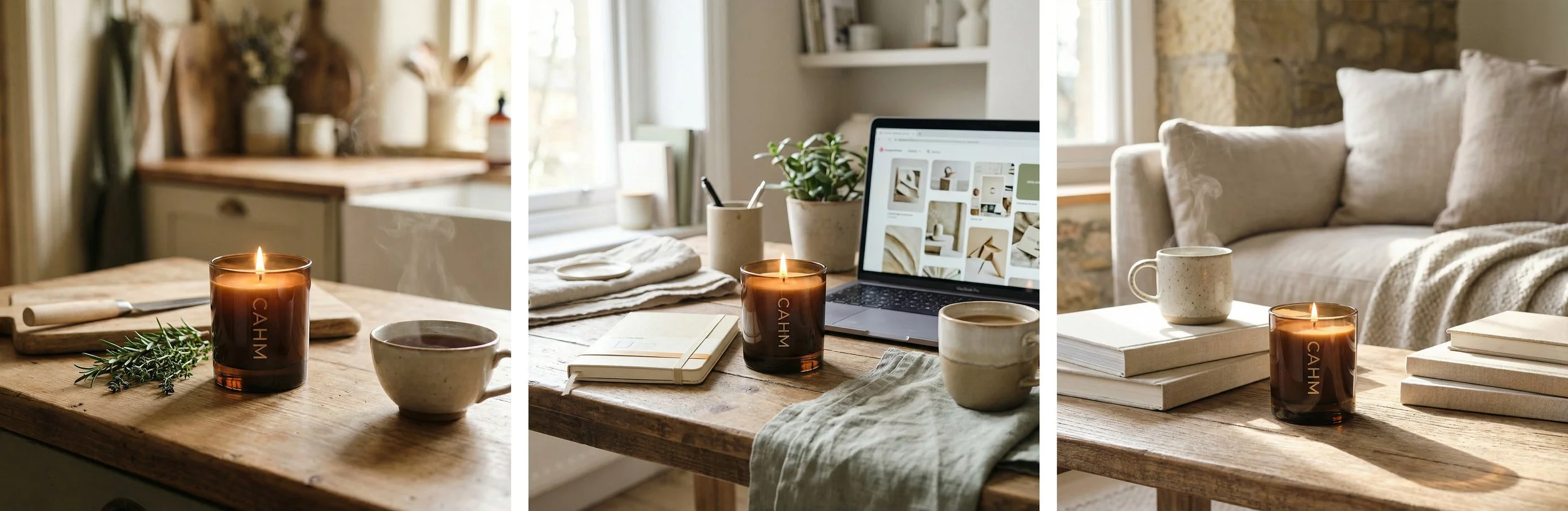
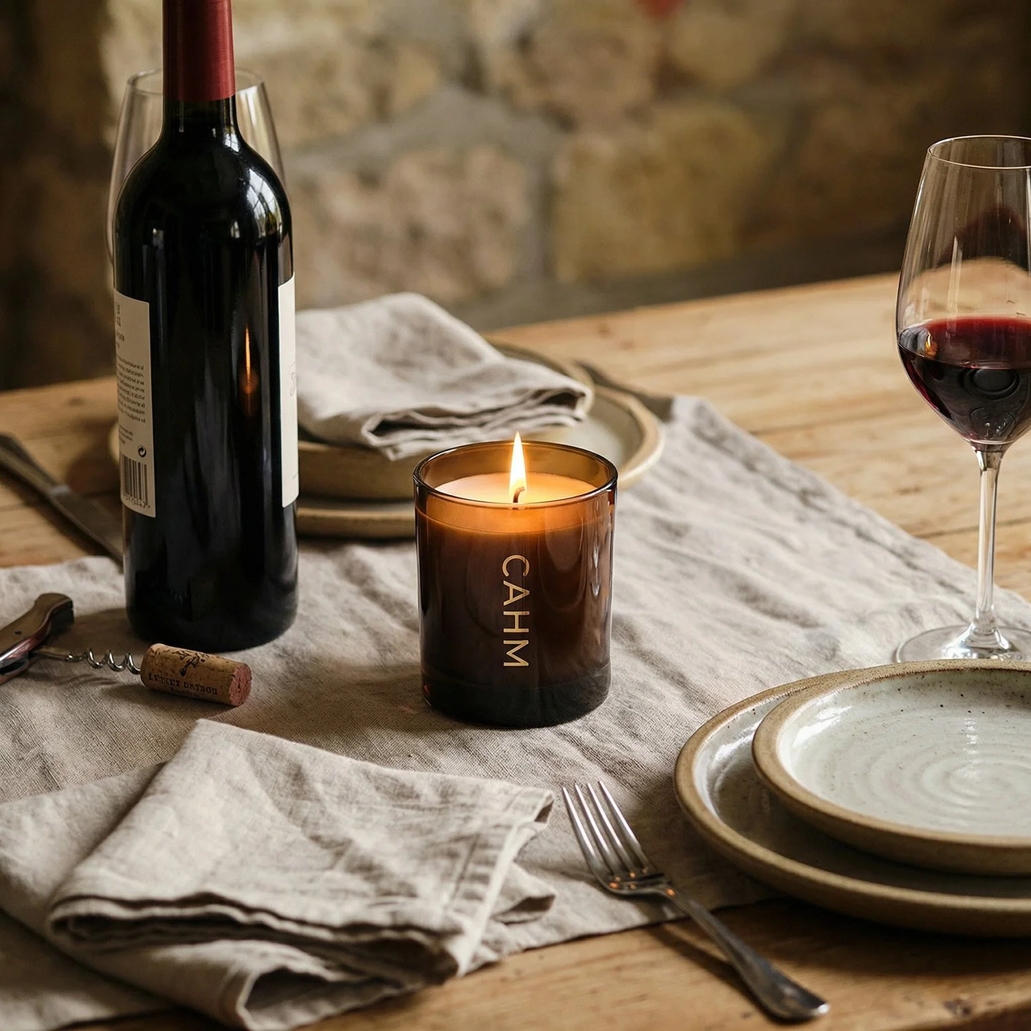
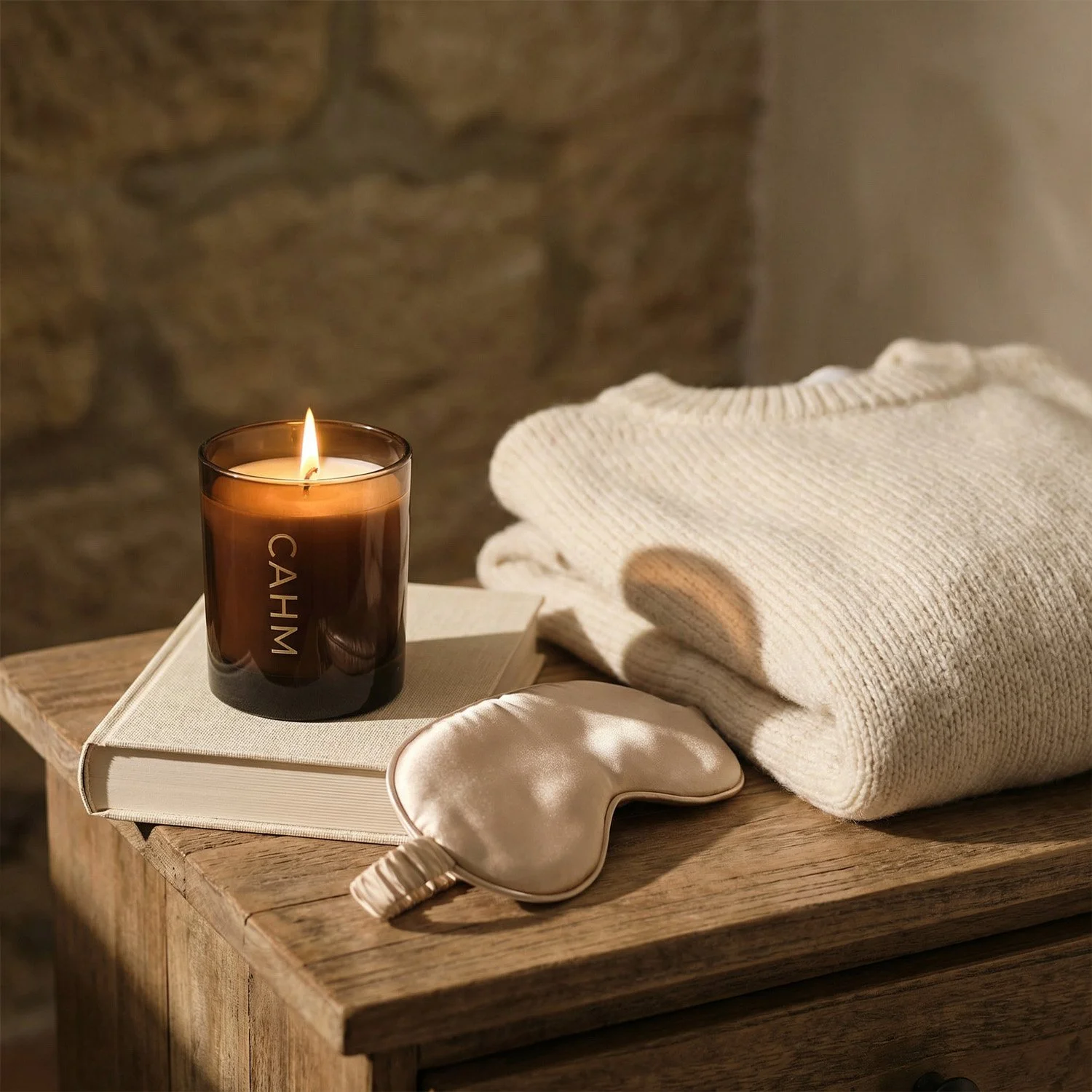
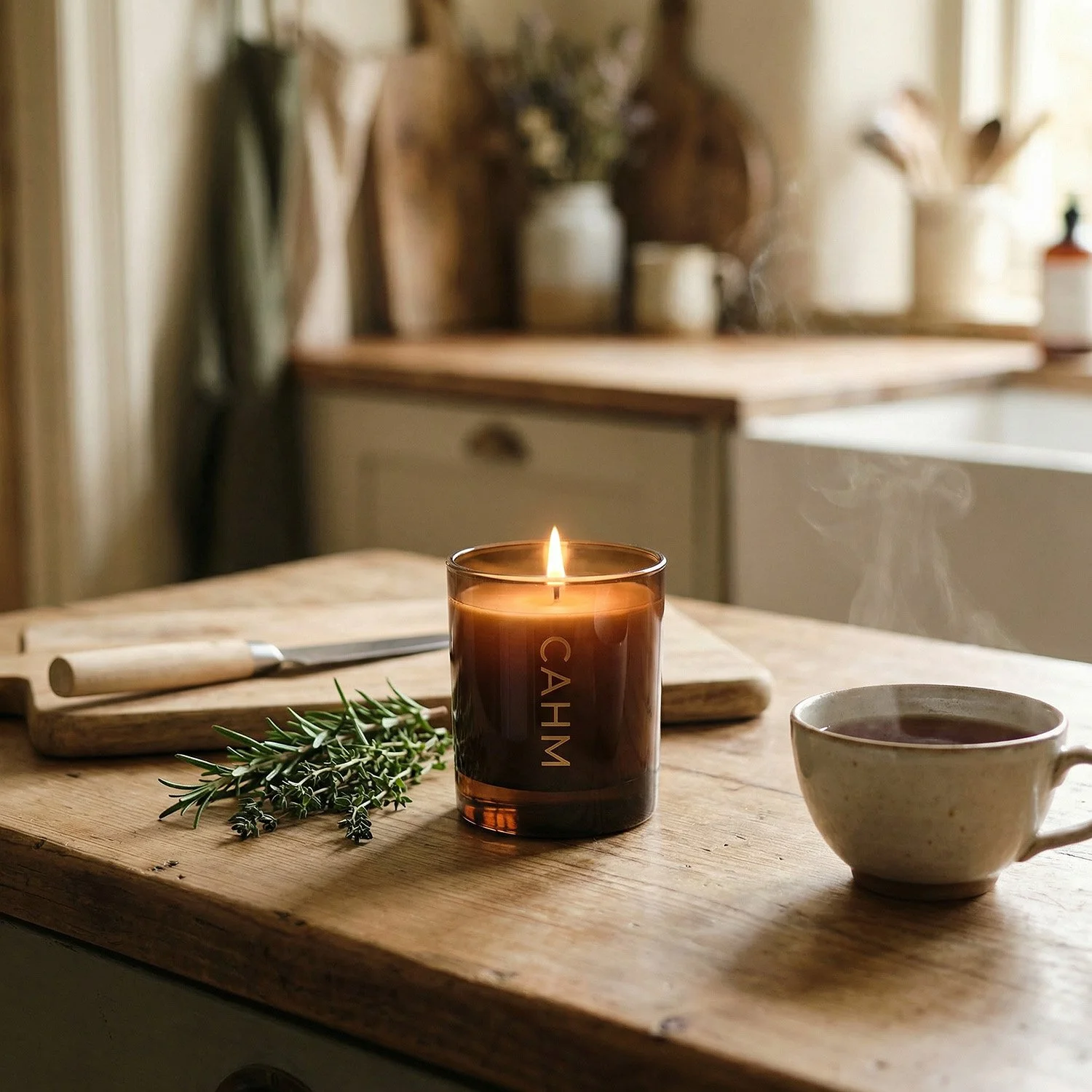
They wanted something that felt like a calm, modern home, with soft light, neutral colours, and a slightly premium but still accessible aesthetic.
The process: mixing real photography with AI
We started with the real product photos, because accuracy still matters, especially for anything being sold online, and then used AI to generate a series of environments that matched the brand mood.
This included:
living spaces
styled interiors
lifestyle surfaces like tables and shelves
soft natural lighting
At this stage, the AI output looked good, but not finished.
The product shape wasn’t always quite right, shadows didn’t always sit properly, and some of the reflections didn’t make physical sense, which is completely normal with AI and exactly where most people get stuck if they’re doing this themselves.
So I took those images into my normal retouching workflow and treated them like any other composite, rebuilding shadows, correcting lighting, restoring product details, and blending the real photography back into the generated environments properly.
The aim was simple, the final images needed to look like something that could realistically have come from a real shoot, even if the shoot itself never happened.
The result: brand imagery that finally made sense
The finished set gave the client something they’d never had before, which was a consistent visual identity that actually reflected their brand.
They now had:
lifestyle content for social media
header images for their website
visuals for email campaigns
creative assets for ads
All using the same products they already sold, just presented in a way that felt intentional, considered, and emotionally engaging.
From the customer’s point of view, nothing felt “AI”, it just felt like the brand had suddenly levelled up visually.
Why this worked better than stock images
The client had originally considered using stock photography, which is what a lot of small businesses do at this stage, but the problem with stock is that it’s never really yours.
You’re always:
compromising on the exact look
adjusting your brand to fit the image
and hoping nobody else uses the same photo
With this approach, the imagery was:
completely bespoke
built around their actual products
aligned with their brand identity
and exclusive to them
Which makes a big difference when you’re trying to stand out in a very crowded market.
The bigger picture
This project is a pretty good example of what I use AI for most in my work, which isn’t replacing traditional photography, but extending what small brands can realistically achieve.
In the past, this kind of visual identity would have required:
a styled location
a full day shoot
a stylist
and a much bigger budget
Now, it can be created in a way that’s:
affordable
flexible
and creatively open
Without losing the professional layer that makes the images actually usable in the real world.
And honestly, that’s the part I find most exciting, not the technology itself, but the fact that small brands finally get access to the kind of visual storytelling that used to be reserved for much bigger companies.