
Case Study: Creating Gritty, Alternative Brand Imagery with AI

One of the biggest assumptions people make about AI imagery is that it always looks polished, perfect, and slightly unreal, the kind of visuals that feel more like stock photography than something you’d ever see from a real, personality-driven brand.
This project was a good example of why that doesn’t actually have to be the case.
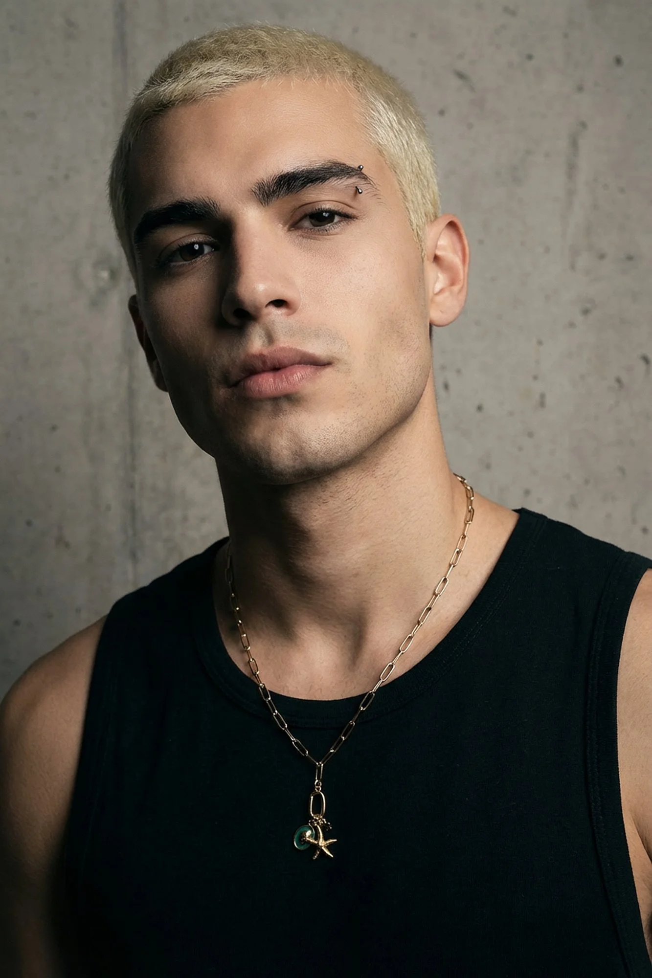
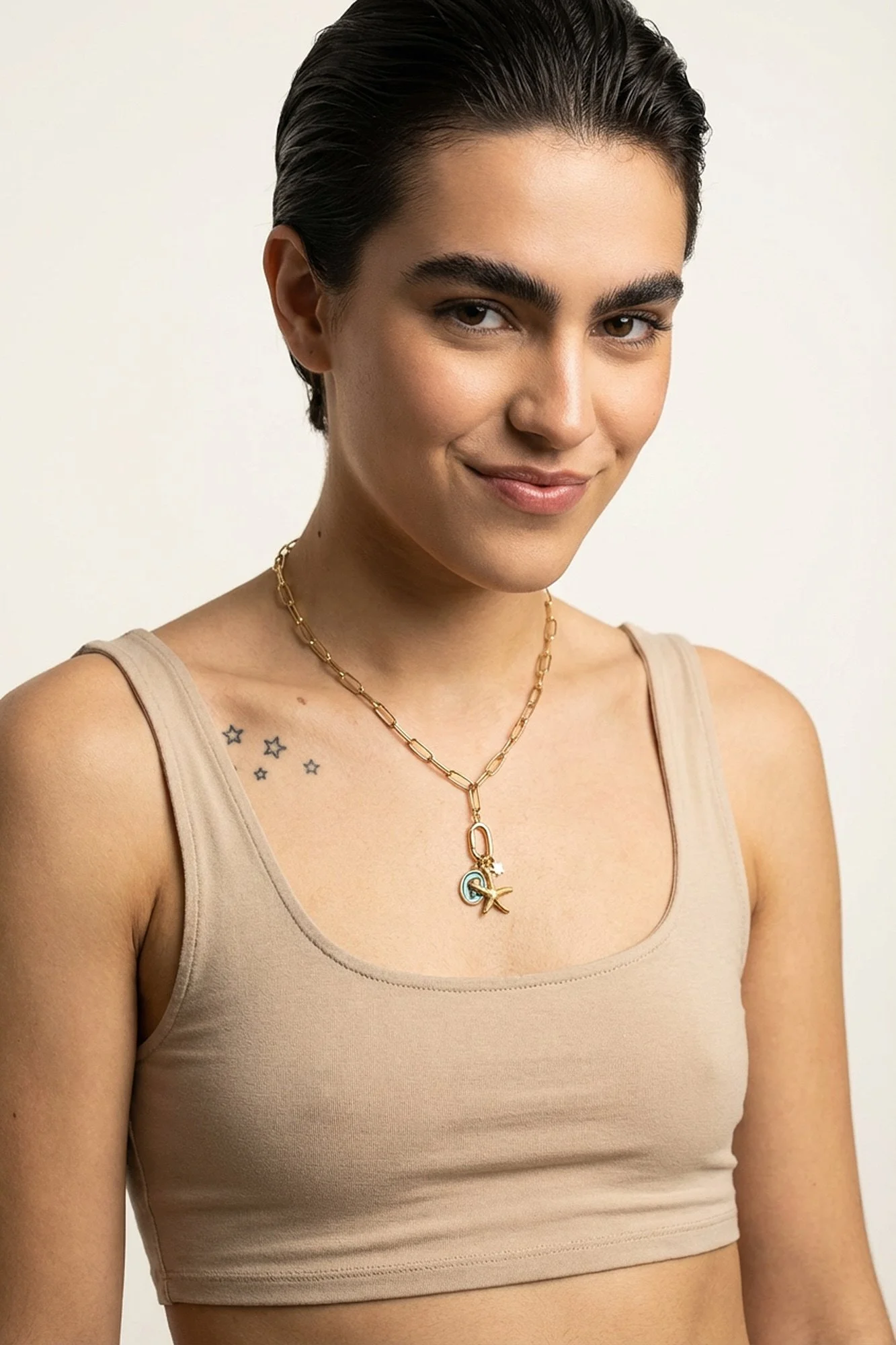
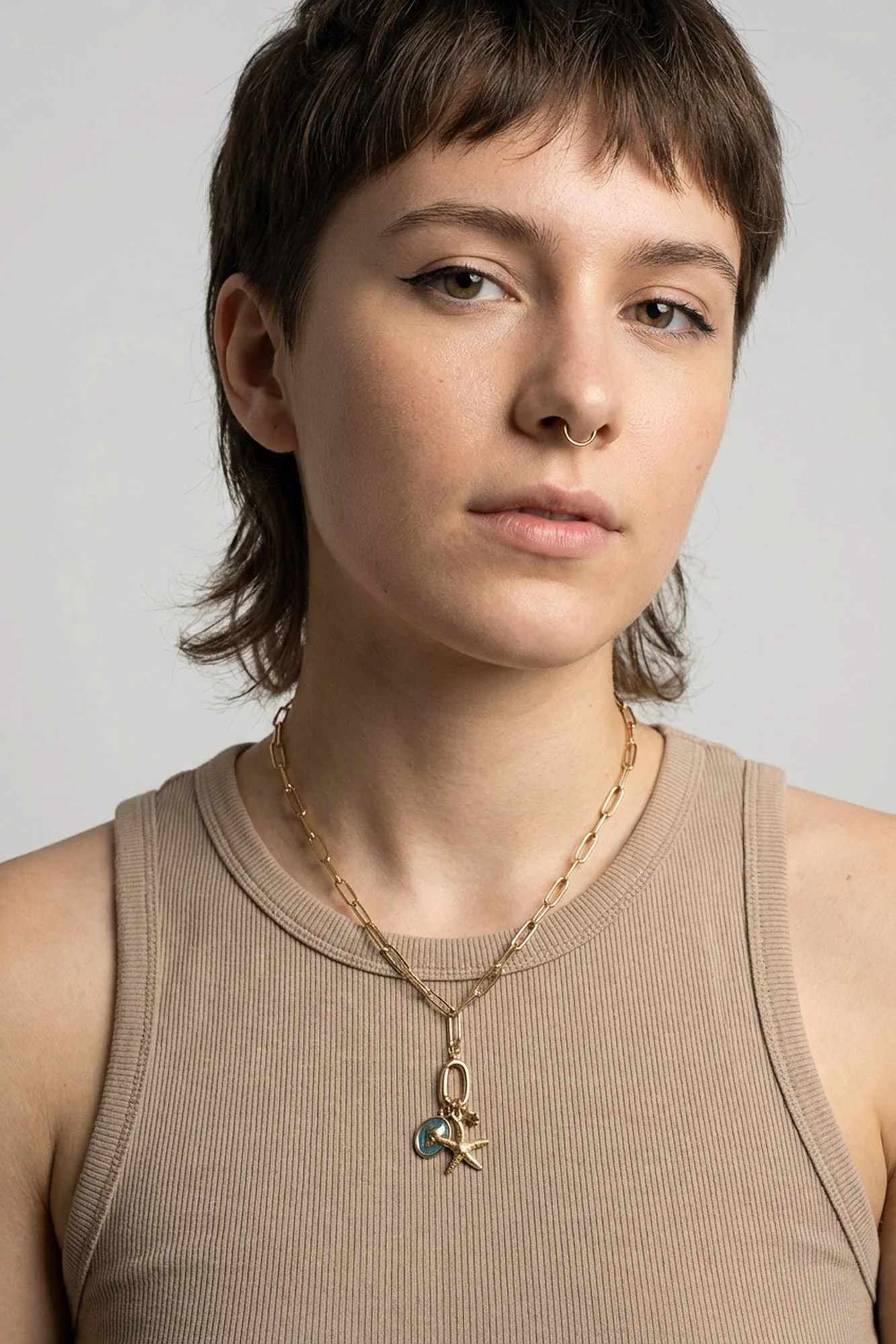
The client was a jewellery brand specialising in charm necklaces, with a very clear target audience in mind, young, alternative, slightly grungy, and not particularly interested in anything that felt too clean, too commercial, or too “influencer”.
They wanted their imagery to feel:
real
character-led
a bit raw
and visually distinctive
Which is pretty much the opposite of what most people associate with AI.
The brief: alternative, not aspirational
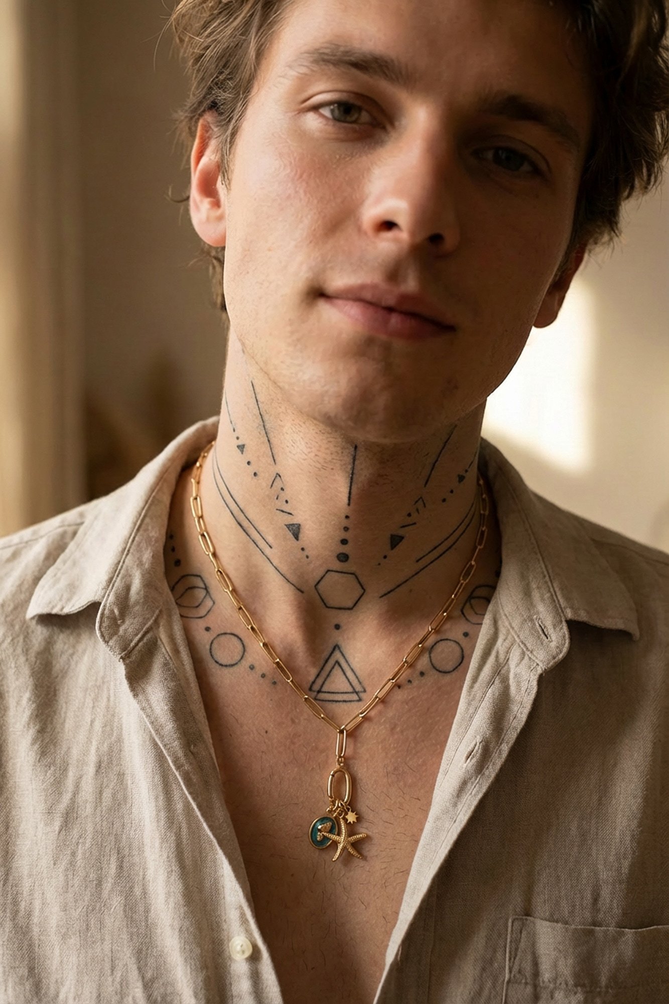
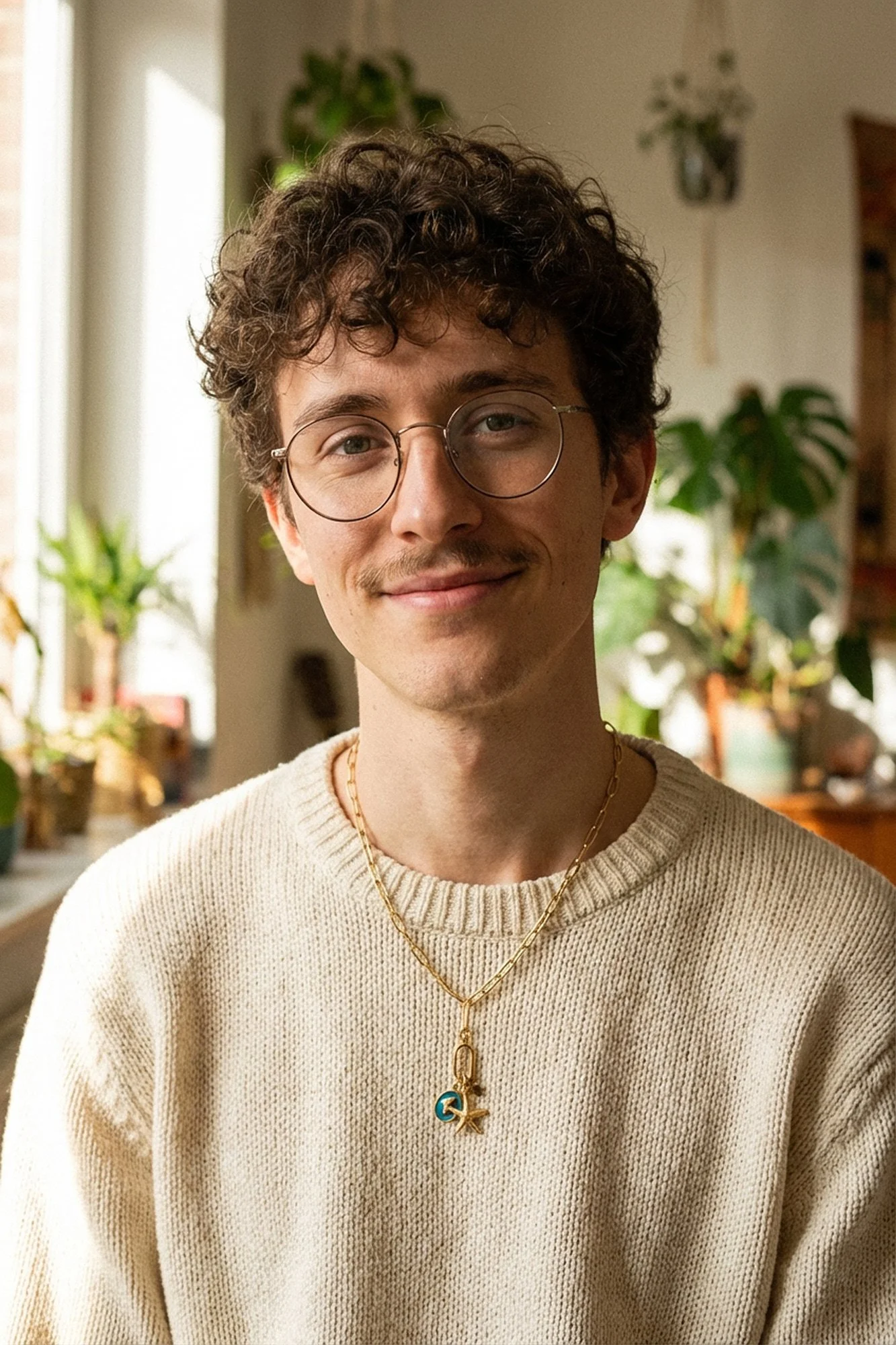
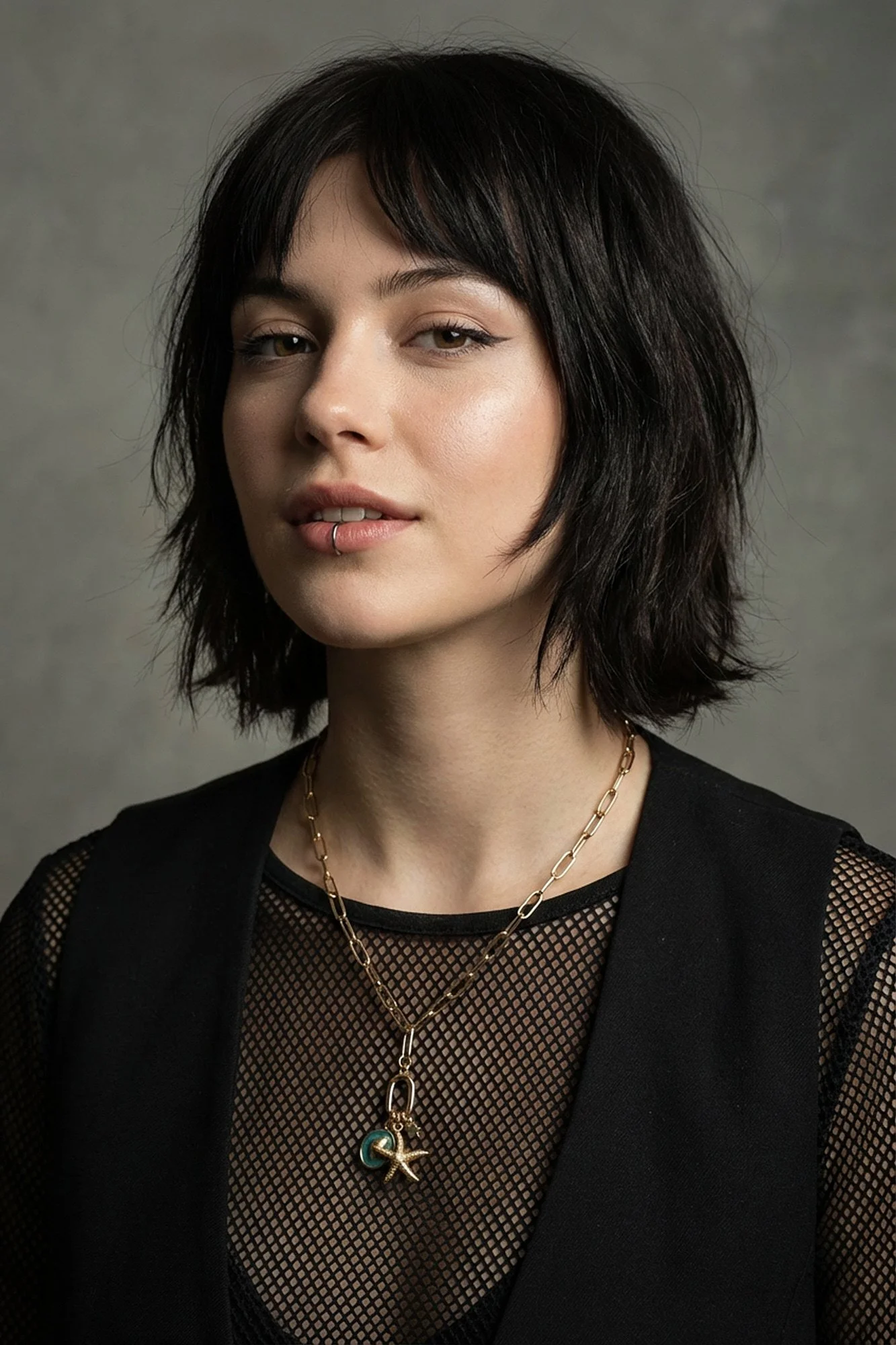
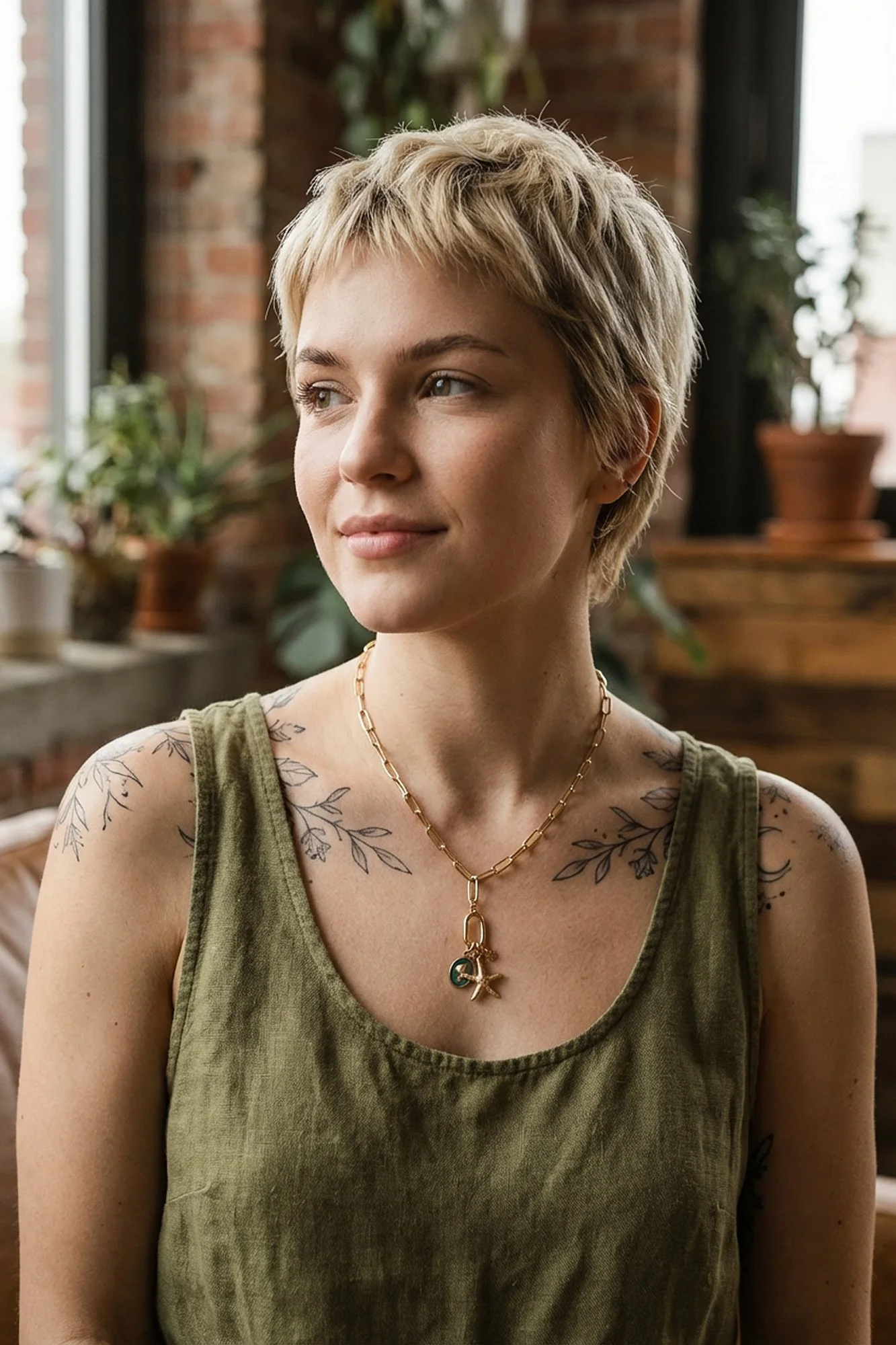
From the start, the brand were very clear that they didn’t want glossy lifestyle imagery or stereotypical “perfect model” visuals, they wanted something that felt more like editorial fashion photography, with strong faces, unusual styling, and a slightly underground feel.
The challenge was that to achieve this traditionally, they would have needed:
multiple models
styling and casting
studio or location hire
a full fashion-style shoot
Which, for a small brand, very quickly becomes expensive and complicated.
So instead of scaling the idea down, we used AI to scale the production down, while keeping the creative ambition exactly where it was.
The idea: use AI to create character, not perfection
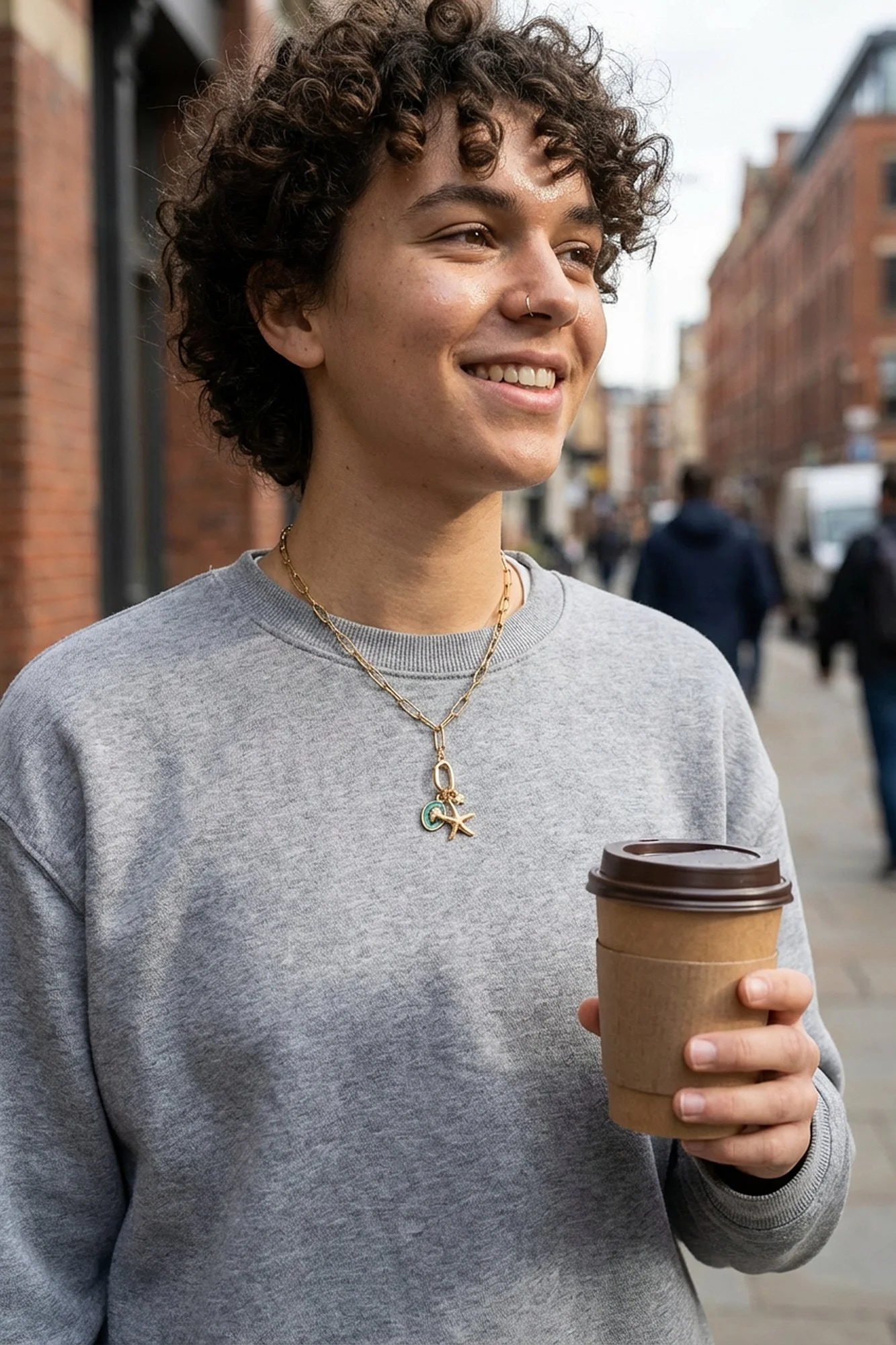
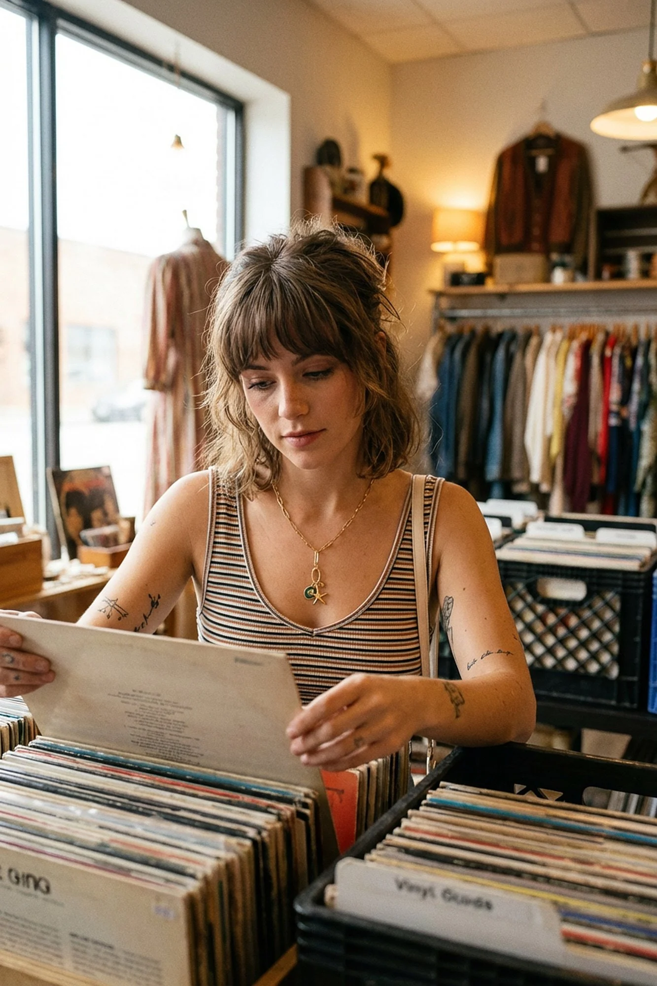
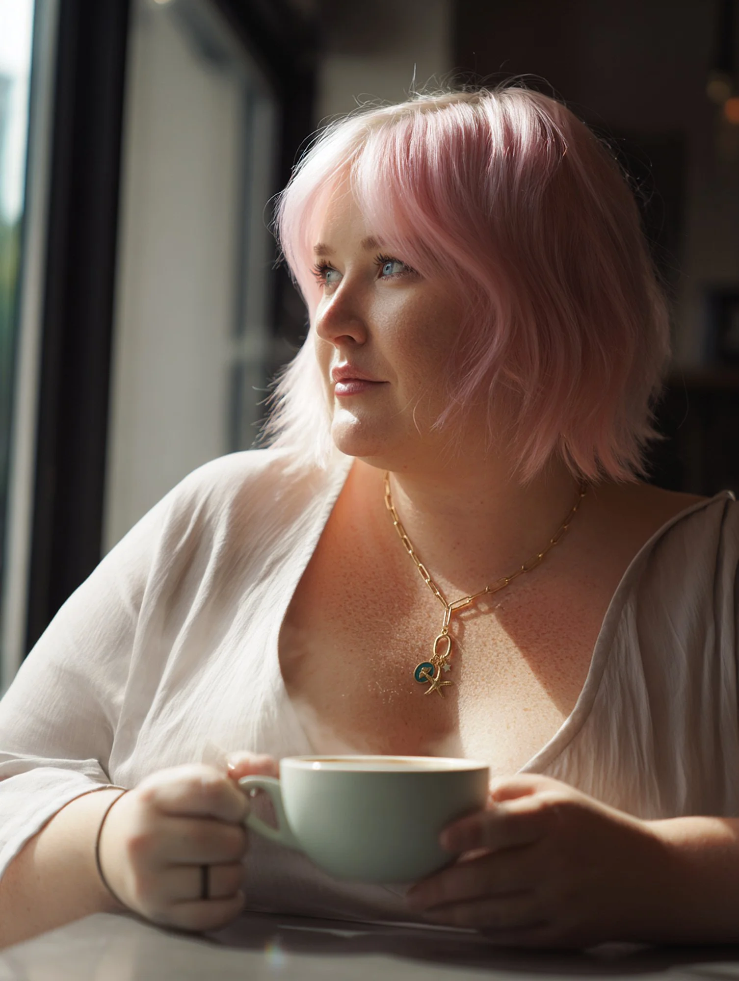
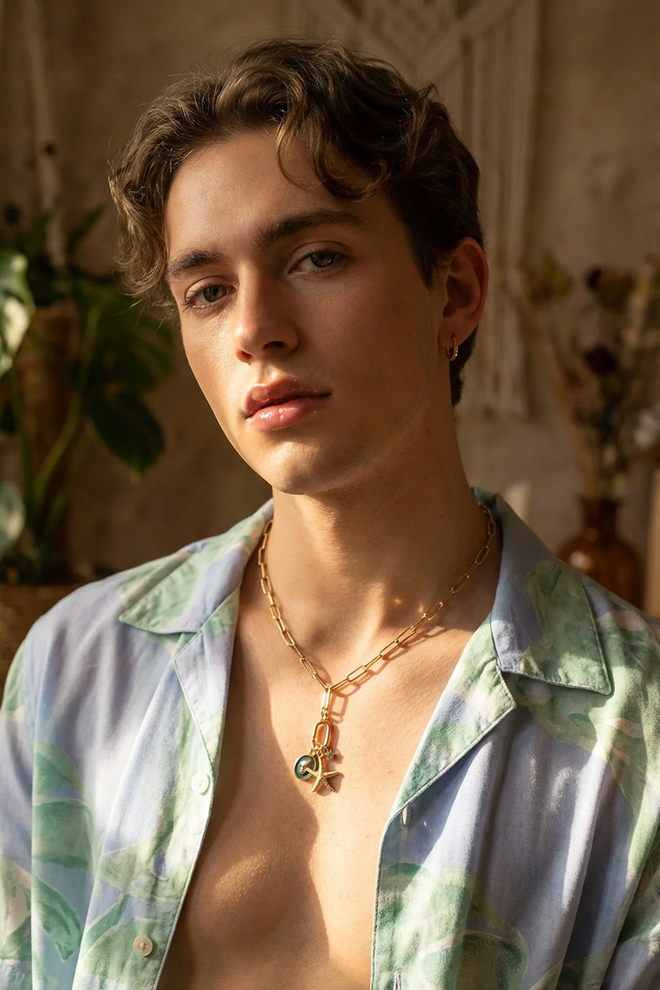
Rather than trying to make the images look “beautiful” in a conventional sense, the goal was to create models who felt believable, slightly imperfect, and full of personality, people you might actually see wearing this jewellery in real life.
We focused on:
alternative haircuts
natural skin texture
minimal retouching
neutral but moody lighting
strong, simple compositions
The kind of visual language you’d expect from a fashion editorial rather than a product catalogue.
This was a conscious choice, because AI is very good at producing flawless faces and perfect symmetry, and that’s exactly what we were trying to avoid.
The process: pushing AI away from “stock”
The first stage was creating a series of AI-generated models that matched the brand’s audience, not in a demographic sense, but in an emotional and cultural one, people who felt a bit edgy, a bit different, and visually interesting in their own right.
From there, I treated the images in exactly the same way I would a real fashion shoot, paying close attention to:
lighting direction
facial structure
shadows and contrast
skin texture
overall mood
At this point, AI gives you a starting point, but it’s still very much a raw file.
I then took the images into my normal retouching workflow and worked on them manually, keeping imperfections, resisting the urge to over-smooth anything, and making sure the jewellery itself stayed accurate and detailed.
The aim wasn’t to make the models look perfect, it was to make the photography feel real.
Lifestyle imagery without models
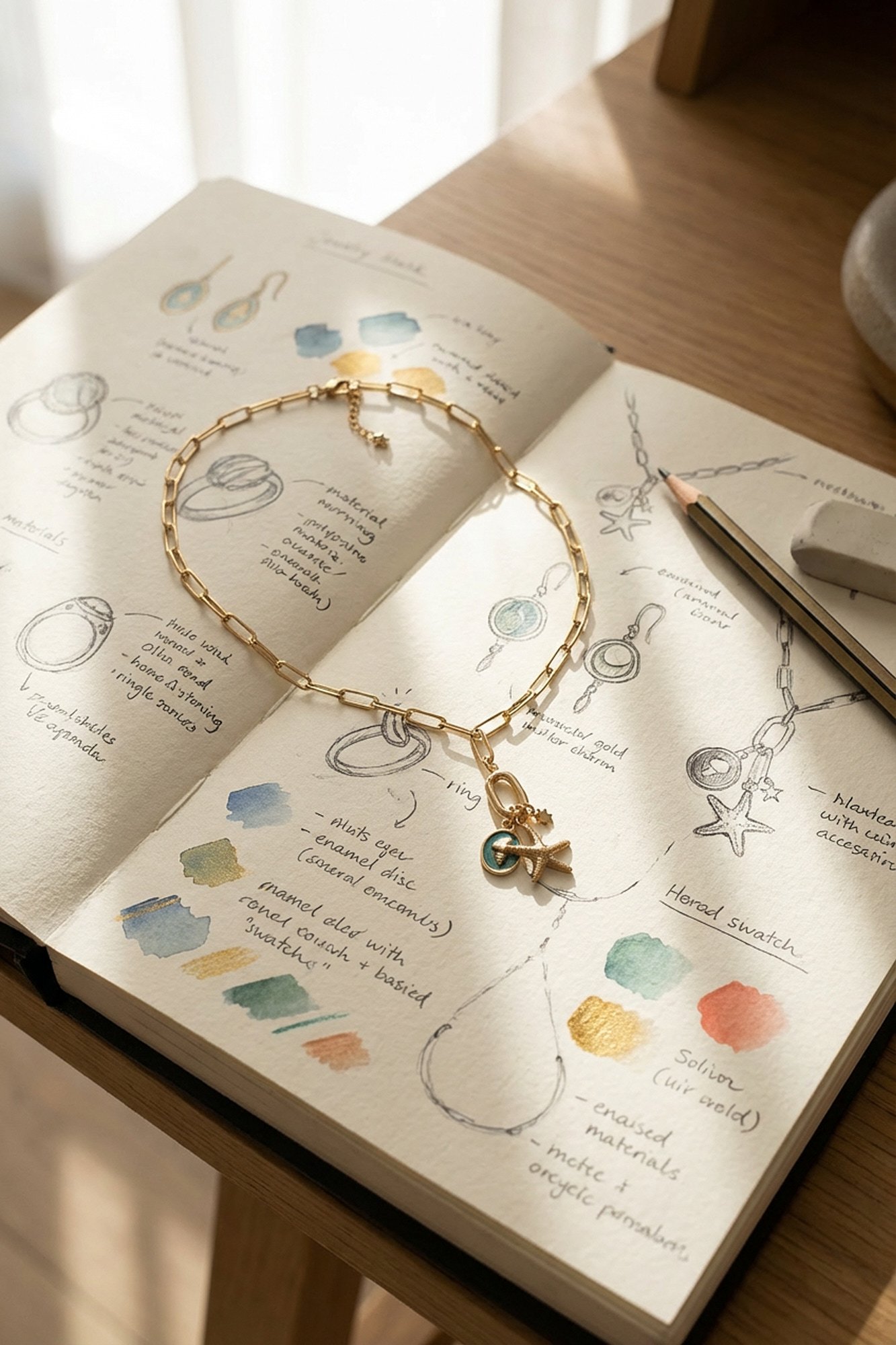
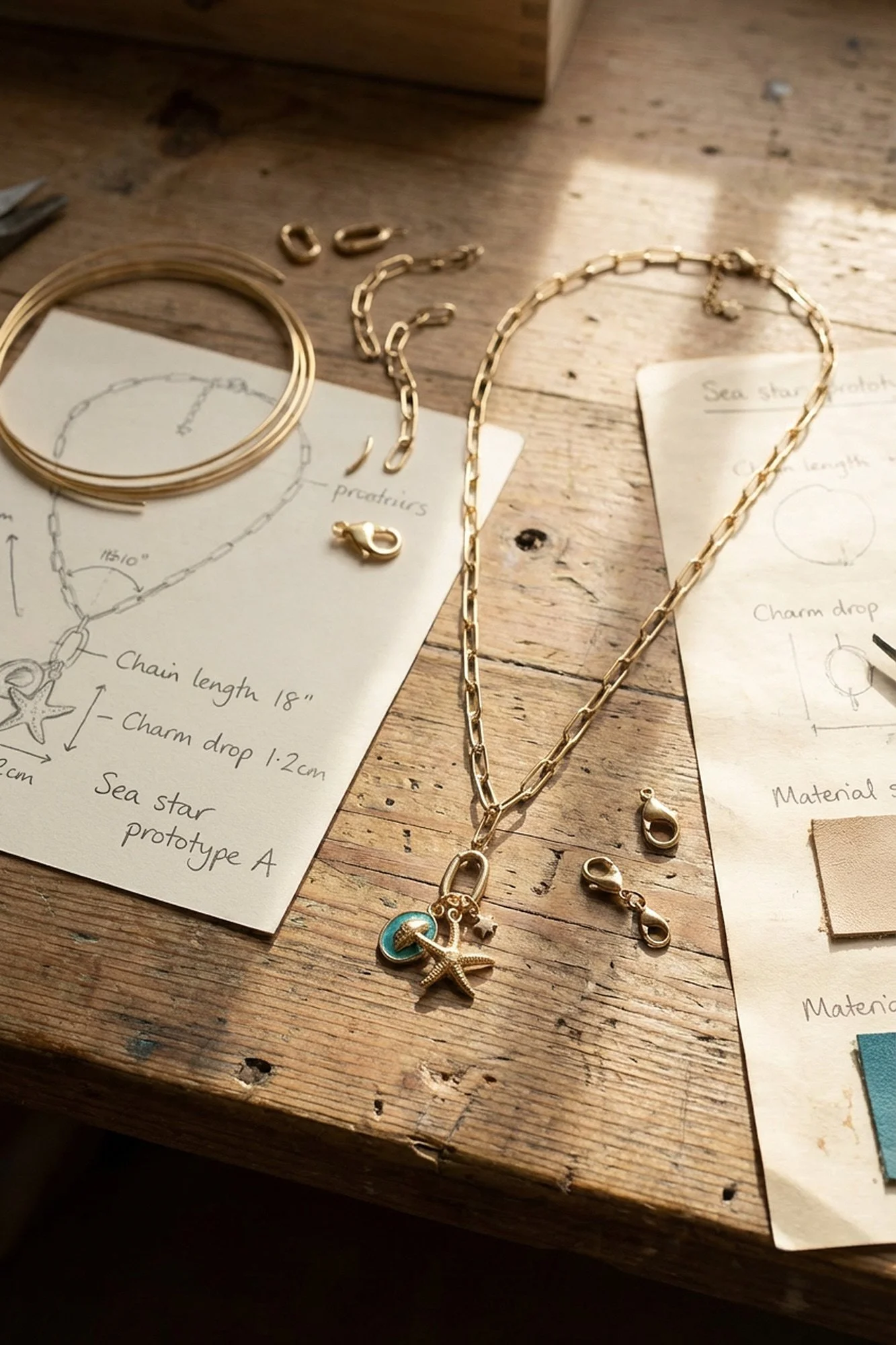
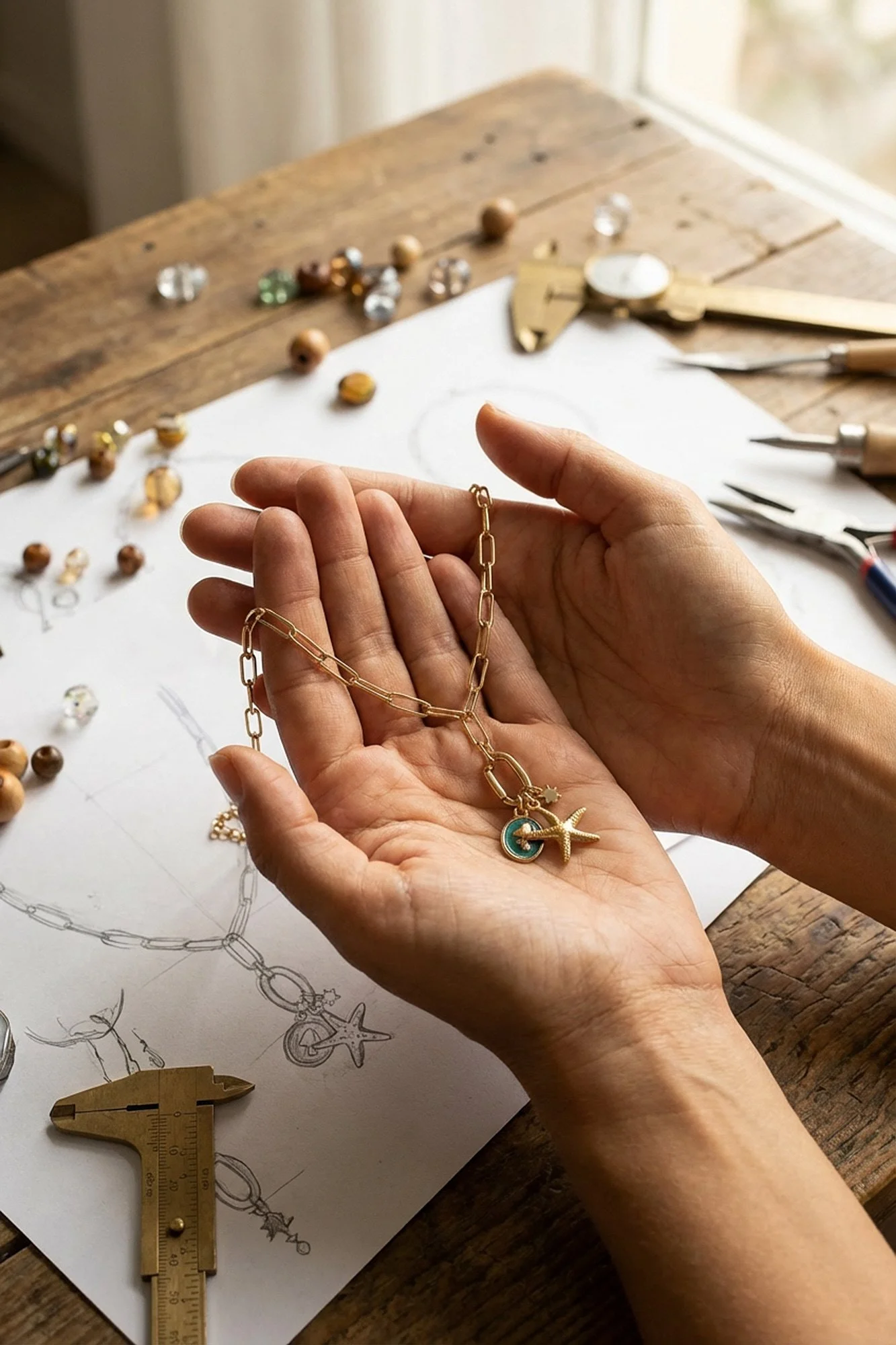
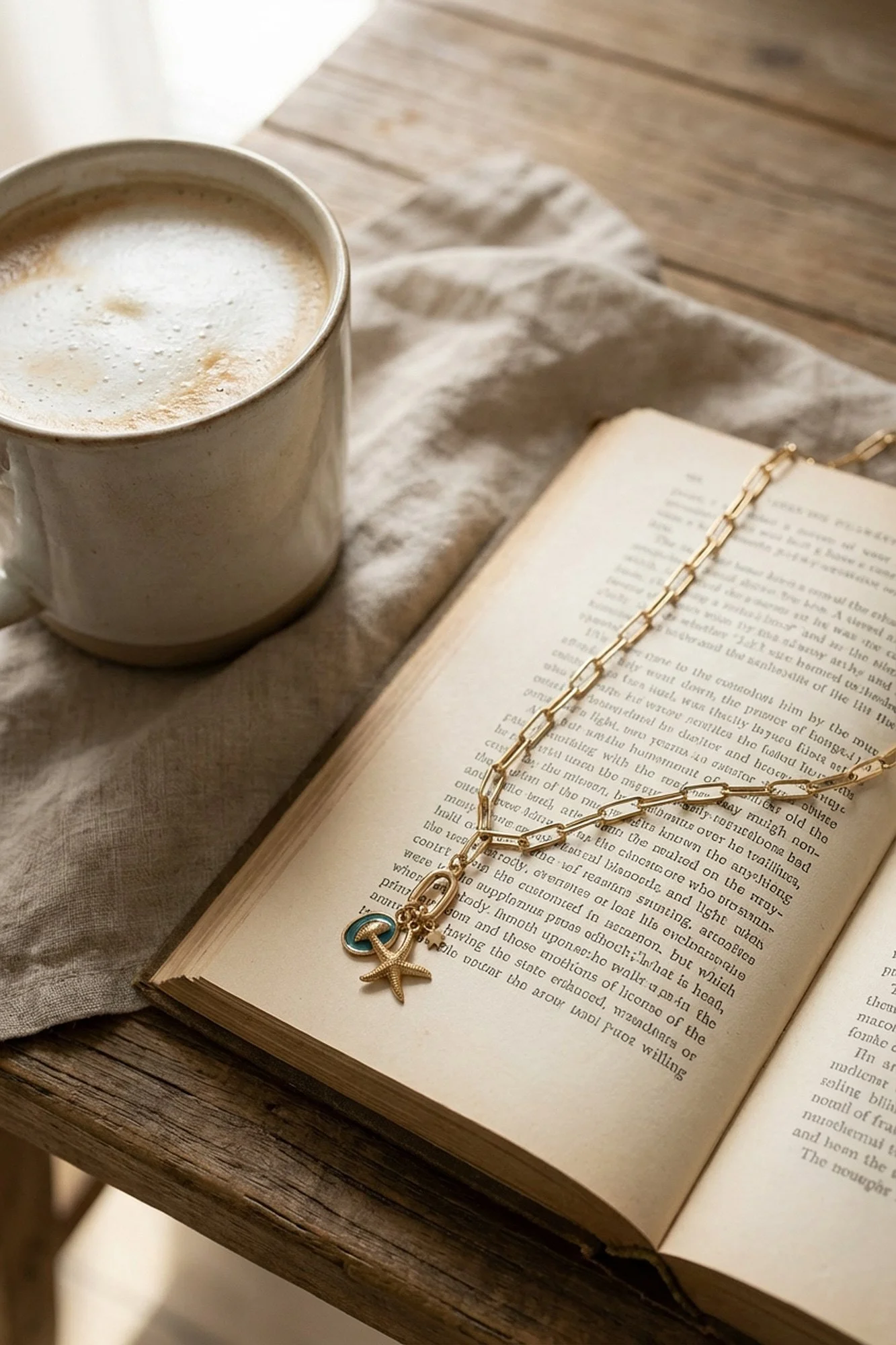
Alongside the portraits, I also created a set of lifestyle images without people, focusing purely on the products in more abstract, textural environments.
These were designed for:
website banners
social media
campaign backgrounds
brand storytelling
Rather than straightforward e-commerce.
Again, the idea wasn’t to make the jewellery look pristine and floating in empty space, but to place it into environments that felt tactile, slightly messy, and visually rich, more like something you’d see in an independent fashion magazine than on a stock website.
The result: AI that doesn’t look like AI
The final image set gave the brand a visual identity that felt genuinely aligned with who they are and who they’re talking to.
They now had:
strong character-led portraits
alternative lifestyle imagery
a consistent visual tone
and a look that stood out from competitors
Most importantly, nothing about the images felt generic.
They didn’t look like stock.
They didn’t look overly polished.
And they definitely didn’t look like what most people expect when they hear the words “AI imagery”.
Why this project matters
This shoot is a good example of why I don’t see AI as something that automatically pushes work towards a single aesthetic, because in reality, it’s just another creative tool, and the outcome depends entirely on the eye and intention behind it.
If you use AI to chase perfection, you’ll get perfect images.
If you use it to chase character, mood, and realism, you’ll get something completely different.
In this case, AI made it possible for a small jewellery brand to have:
multiple models
an editorial-style campaign
and a strong, alternative visual identity
Without needing a full fashion production.
And honestly, that’s the version of AI I’m most interested in, not the one that replaces creativity, but the one that gives smaller brands access to the kind of visual language that used to be reserved for much bigger names.